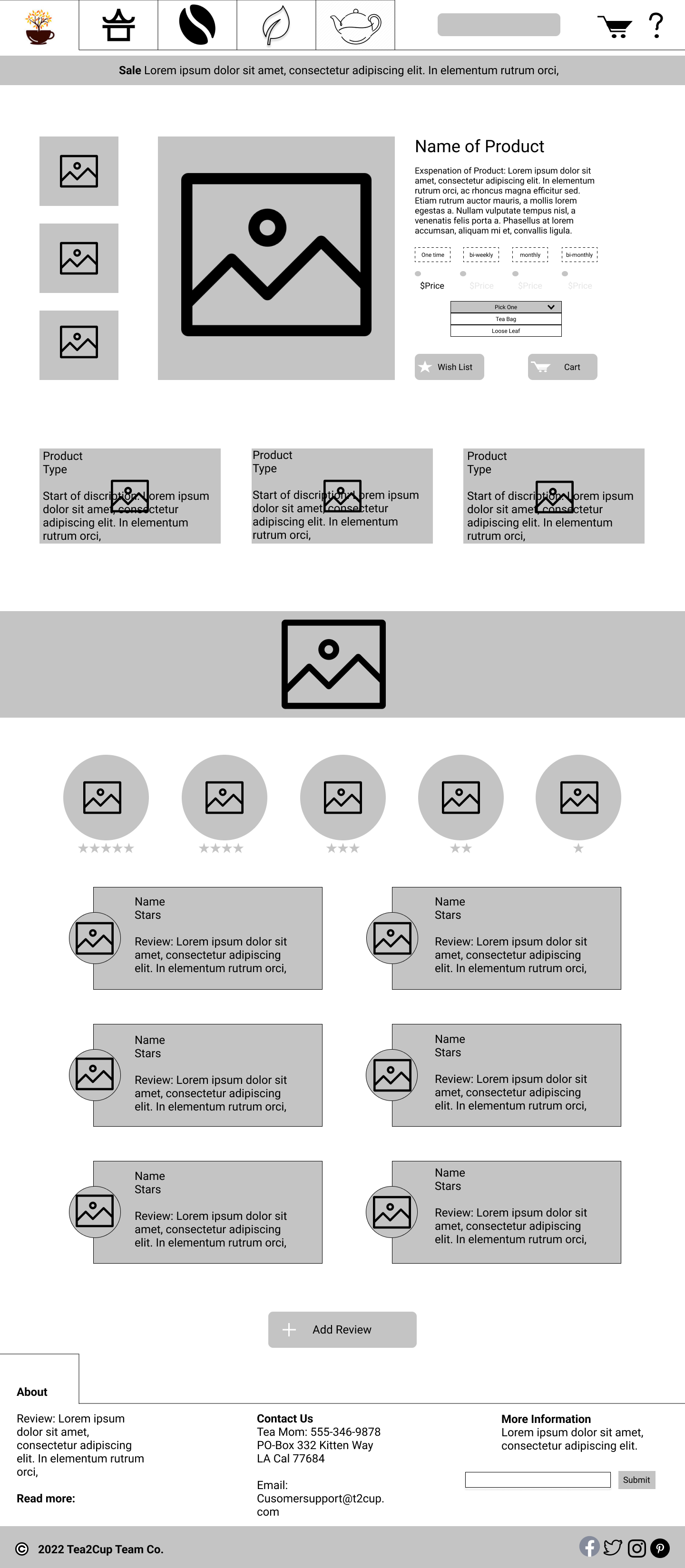
Tea Website Design
We were task with designing a website for a make believe tea company. We researched competitors and went with a design we thought best fit the theme.
Year
2023
Client
School Project


Work Flow
What was the project
We were task with designing a website for a make believe tea company. We were to do research and also work on color theory and typography.
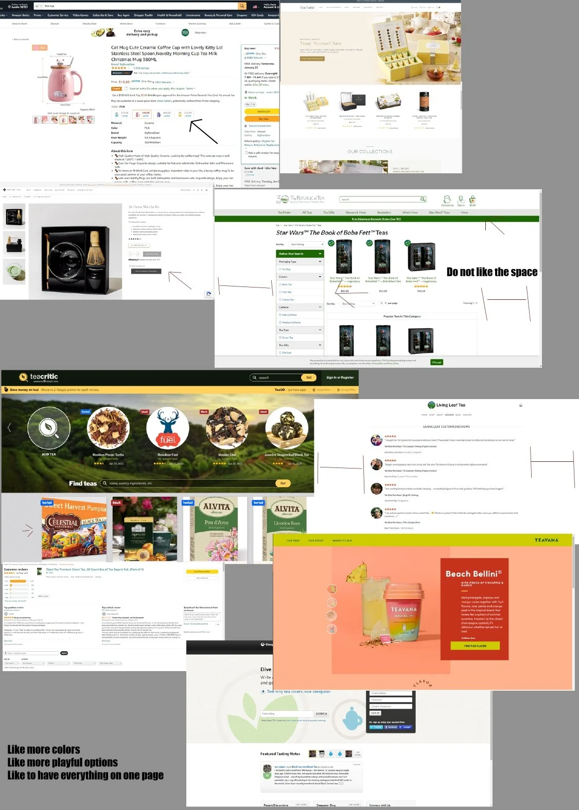
Starting off!
I got some references from other tea sites to see what I liked about their design and what I thought could be improved on. Then I went and made a mood board. That way I could see colors together and get the feel of how I wanted the website to look.
Colors
I selected a palette of lighter greens and yellows complemented by subtle accents of purple to evoke a calm and relaxing atmosphere. These colors were chosen for their soothing qualities and their ability to create a welcoming user experience. Additionally, I avoided using pure black, instead opting for deeper shades derived from the existing color palette. This approach, emphasized by my instructor, helps maintain visual harmony and reduces harsh contrast, contributing to a more cohesive and user-friendly design.
Typography
For the typography, I chose fonts that reflect the calm, organic nature of a tea shop experience. The primary typeface is clean and modern with soft, rounded edges, promoting readability while maintaining a warm, approachable feel. To complement this, I selected a secondary typeface with subtle, hand-crafted characteristics to evoke a sense of tradition and authenticity, qualities often associated with tea culture. The combination creates a balanced visual hierarchy that feels both refined and inviting, reinforcing the overall relaxing tone of the design.